Hi all
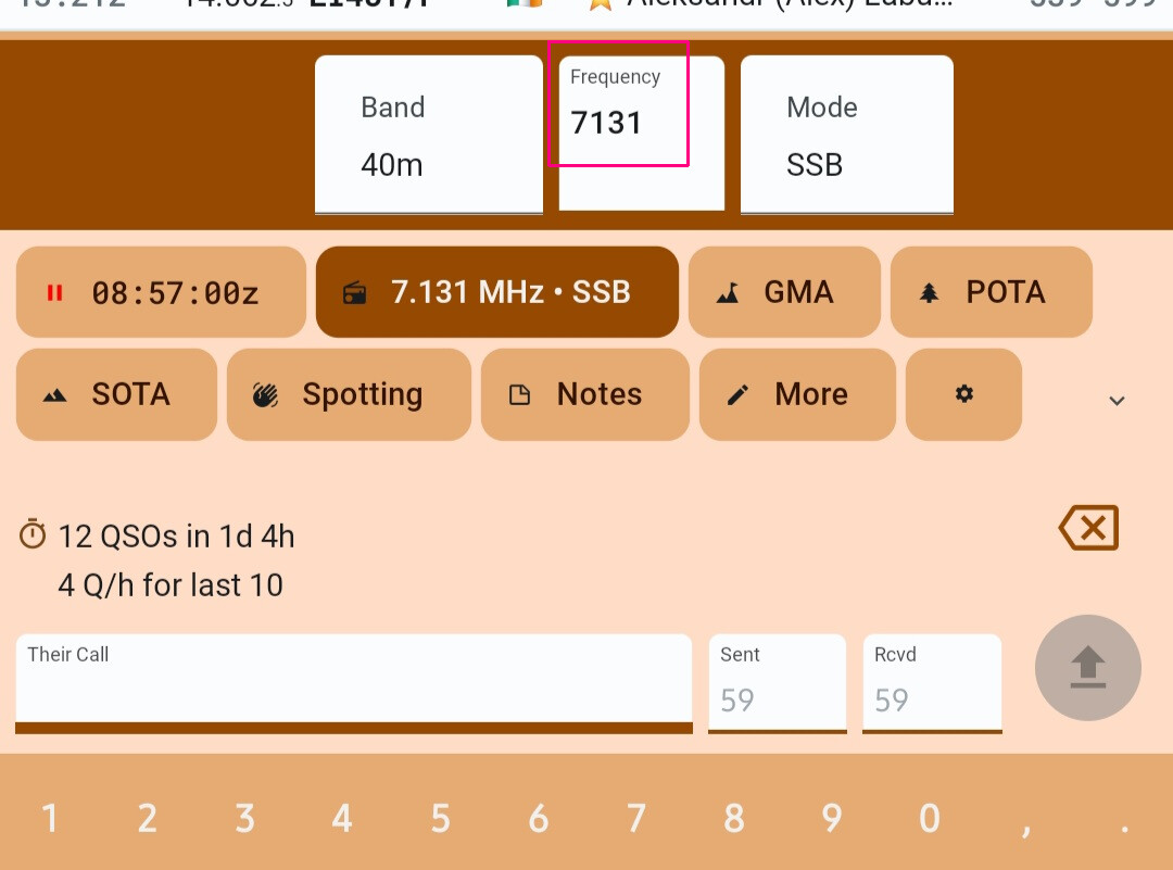
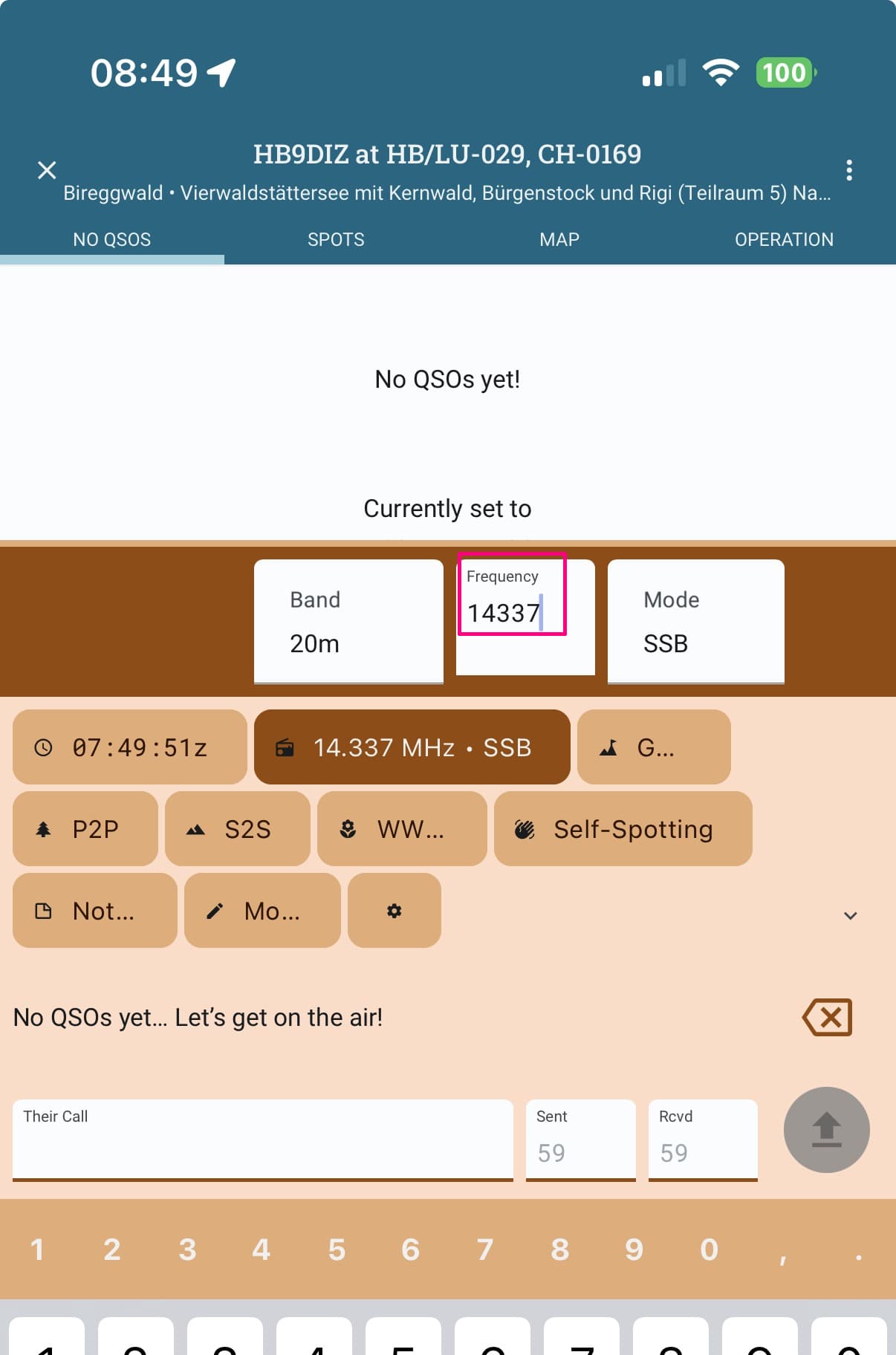
When tapping the frequency box, its content has a mismatch in font size and position, see snippet.
Vy 73, Markus
PS: Good idea to mark (underline in bold) the active box on the entry line.
Hi all
When tapping the frequency box, its content has a mismatch in font size and position, see snippet.
Vy 73, Markus
PS: Good idea to mark (underline in bold) the active box on the entry line.
Can you confirm your version please Markus?
I have 3 devices (iOS and 2 Androids) and they all show these features..
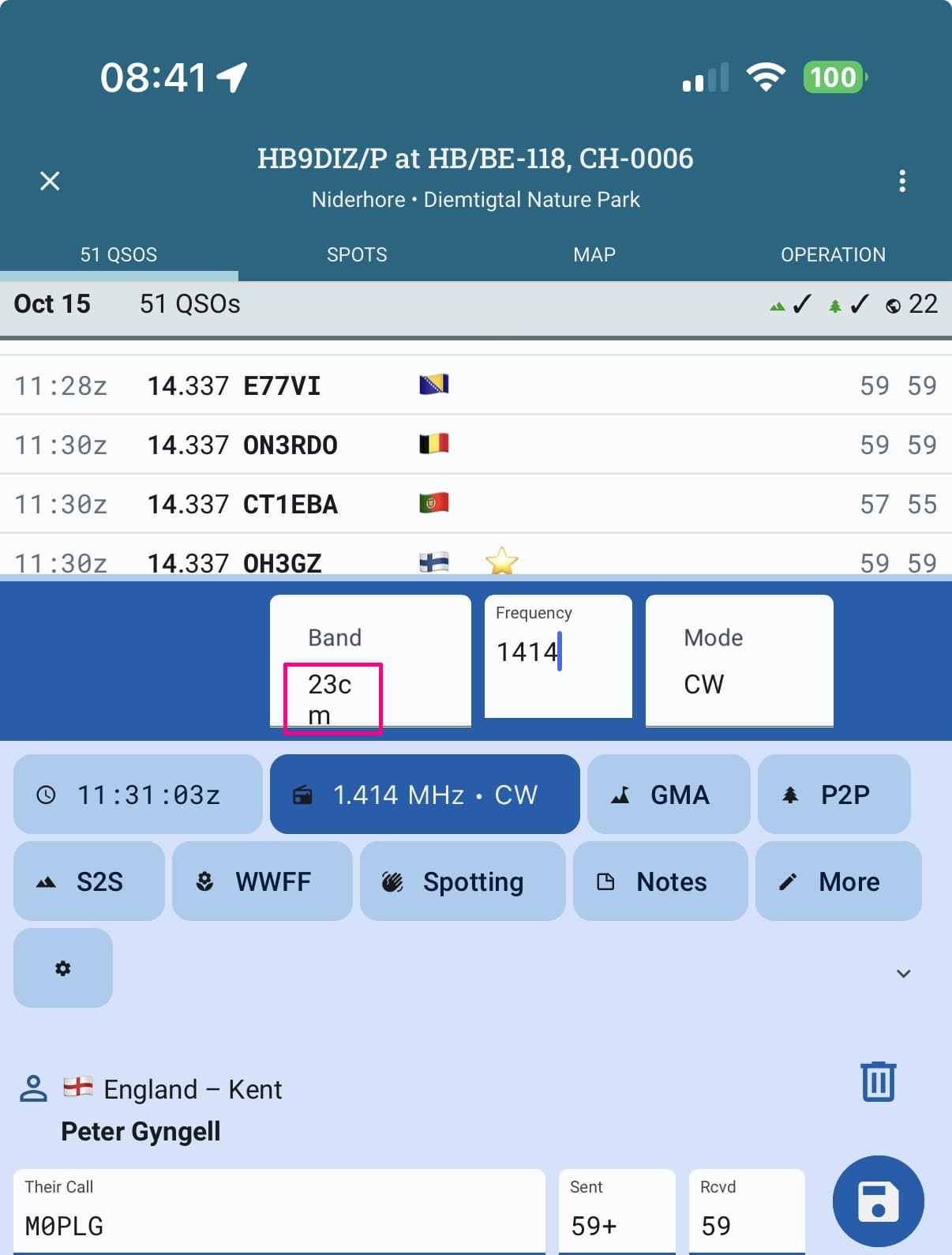
The frequency box is slightly smaller. The fonts are the correct size. The caption Frequency is slightly smaller. Otherwise I would not really have noticed it.
I have this version
Hi Alan
I’ve just checked, I am on the same build on Android and iOS like you. My experience on this topic is the same for both operating systems.
Thanks for looking into it. I am on the smallest possible font with my screenshot. When I switch to the largest possible font it looks like yours. I think that all entry boxes should look and feel the same way.
The frequency box is slightly smaller at the bottom nearby your lower red line since even this entry box receives a thicker bottom line when you hit it. It has here the same color like the background, so looking less high.
Btw hny Alan, thanks for having found a way into 2026 and doing here this important background job.
Vy 73, Markus
OK thanks Marcus,
There have been a few tweaks lately with fonts. We’ll add this to the next round of tests.
Alan
Markus,
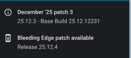
Can you see if this is improved with the current release Dec patch6?
Alan
Hi Alan
My current (up to date) version is patch 5, showing the former behavior.
Will look into it after the patch 6 update.
73, Markus
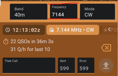
Just been testing on recent version December patch 8:
It looks still unchanged to me:
I would suggest that all these three entry fields should have the same look.
Still testing this on the smallest font size offered by Polo.
Additionally, and seen by incident:
The band value “23cm” seems to break up in 2 lines, so I suppose that that field is too less wide. I suggest to give more room to longer band values like “23cm”, since the white space of that field seems to be wide enough.
Vy 73, Markus
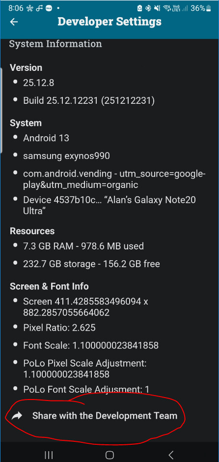
How do I get to this screen?
Markus,
Tap the Share link at the bottom to send the information to Sebastian
Alan
Hi Alan
How? Tapping that link doesn’t open a prepared action. Tapping e.g. the e-mail icon opens a prefilled e-mail, but the “to” is empty. What is the desired action?
73 DIZ
email it to help@ham2k.com
the email address for Contact Us at the bottom of the settings tab
OK, understood now – a reasonable way to bring this on your desks, hi!
E-mail with 3 files sent some minutes ago.
Vy 73, DIZ
Fine now for me with 2026-02.
Thanks all and vy 73, DIZ